UI/UX Designer & Researcher
Designing experiences that matter.
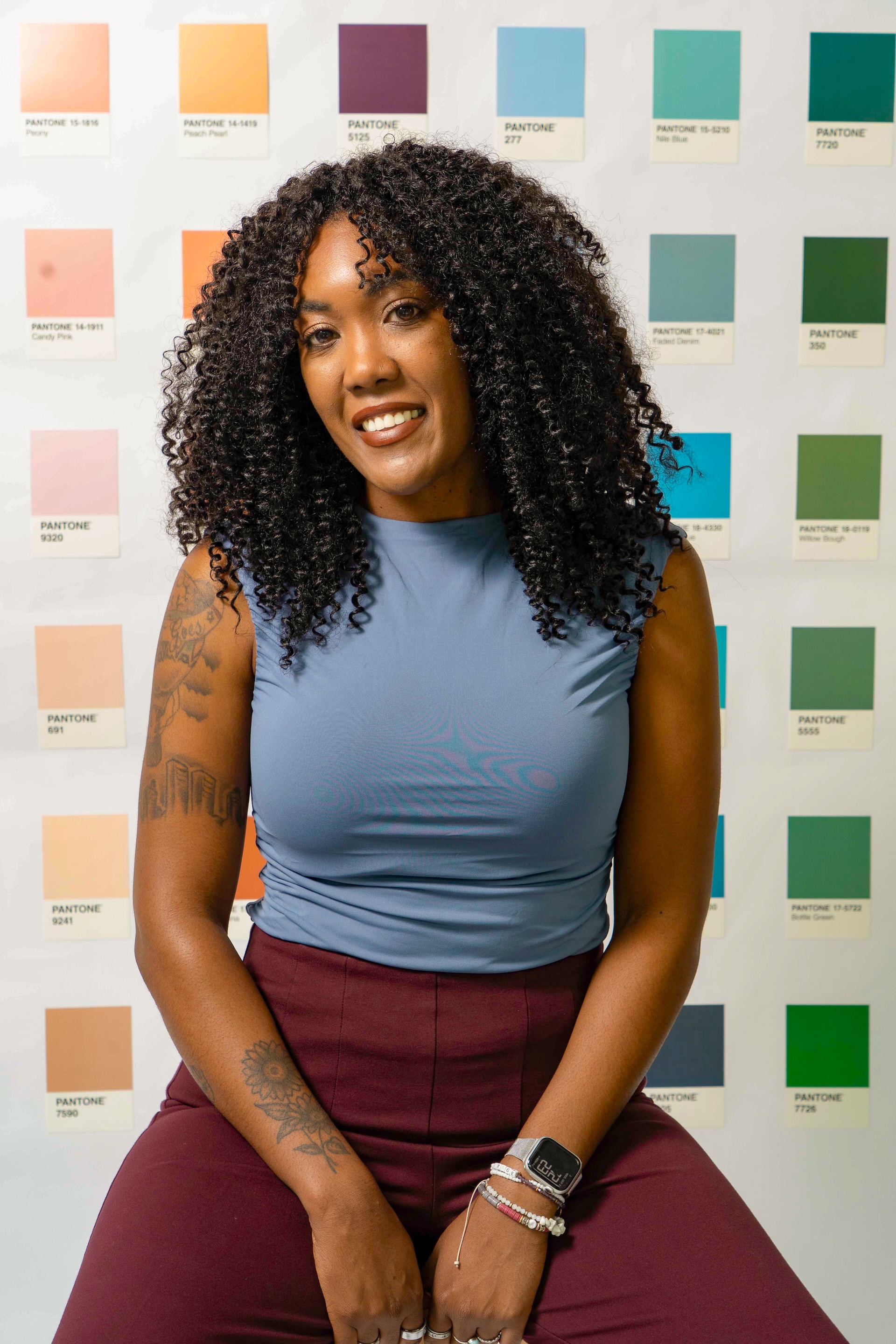
Hi, I'm Cat. I'm currently pursuing my M.S. in Experience & Information Design. I create human-centered experiences that are intuitive, intentional, and a little bit fun.
UI/UX Design✦
User Research✦
Information Architecture✦
Prototyping✦
Interaction Design✦
Experience Design✦
Figma✦
Design Systems✦
UI/UX Design✦
User Research✦
Information Architecture✦
Prototyping✦
Interaction Design✦
Experience Design✦
Figma✦
Design Systems✦
Featured Work
All Projects01
Human Centered Design · Case Study
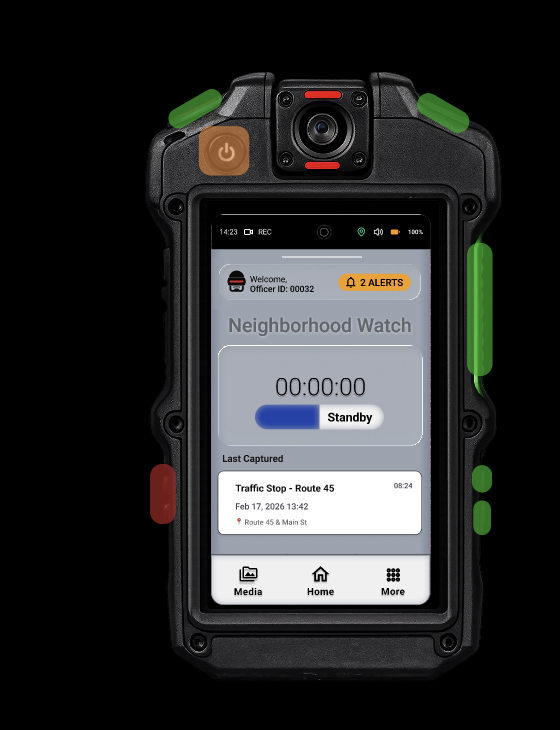
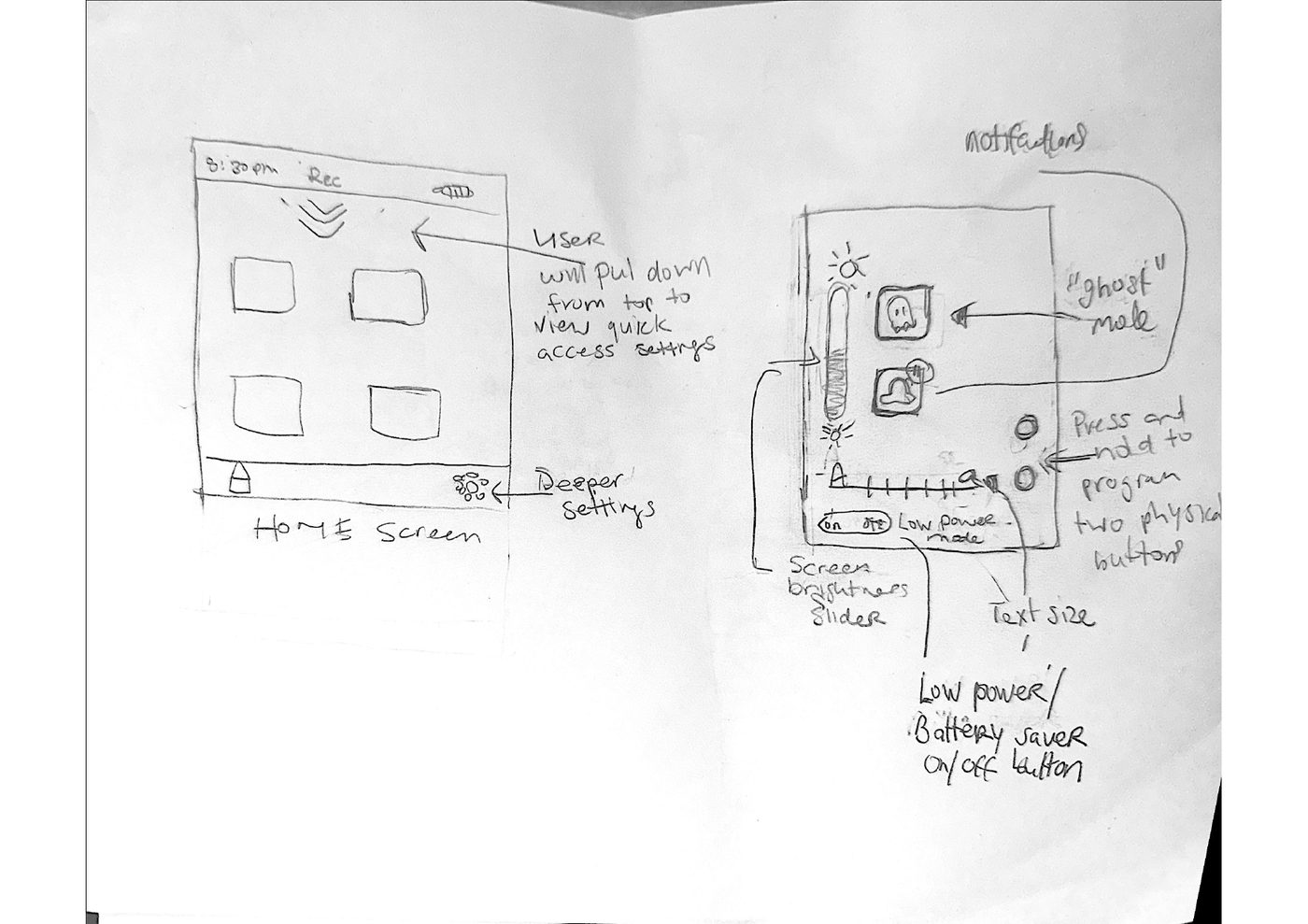
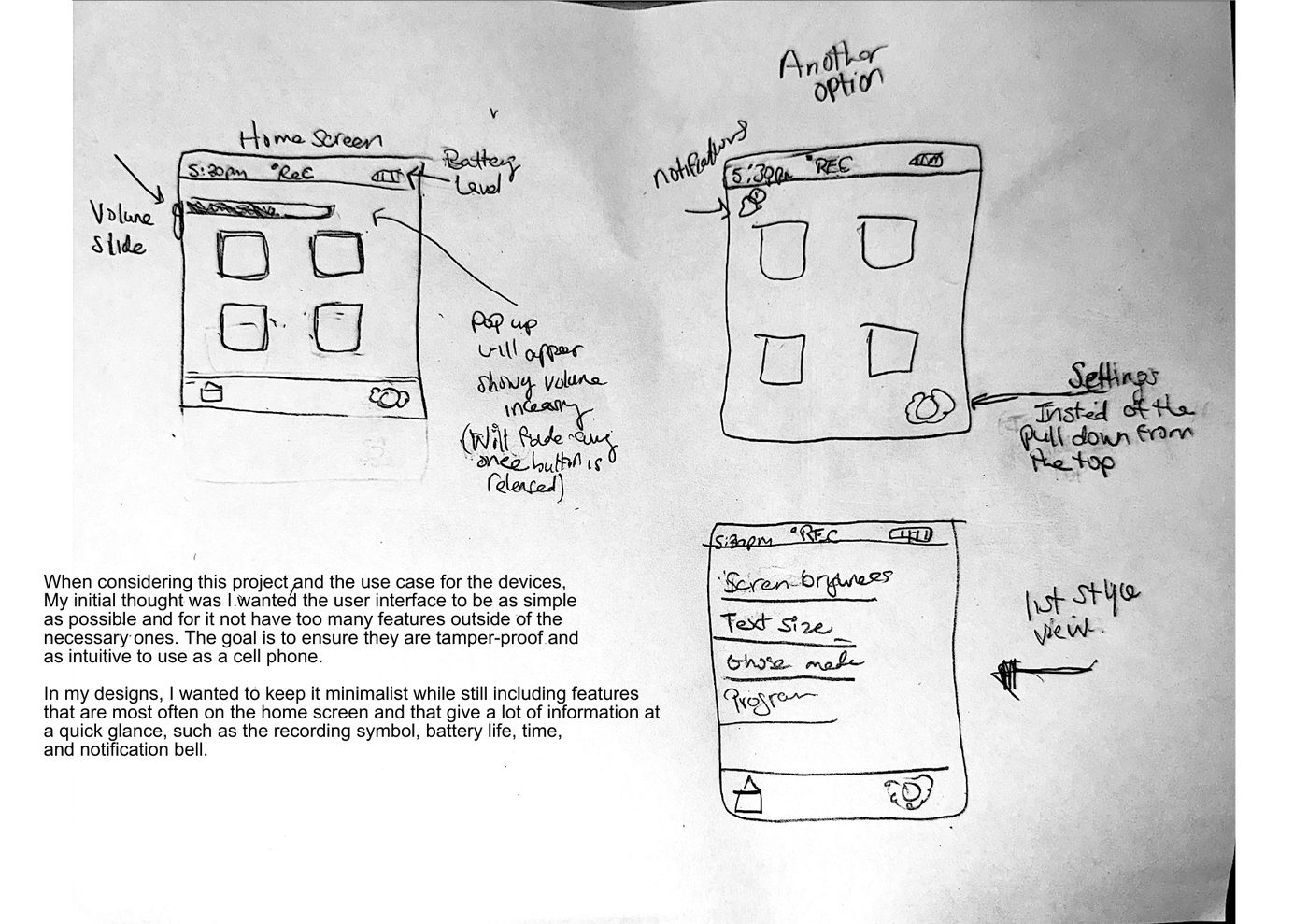
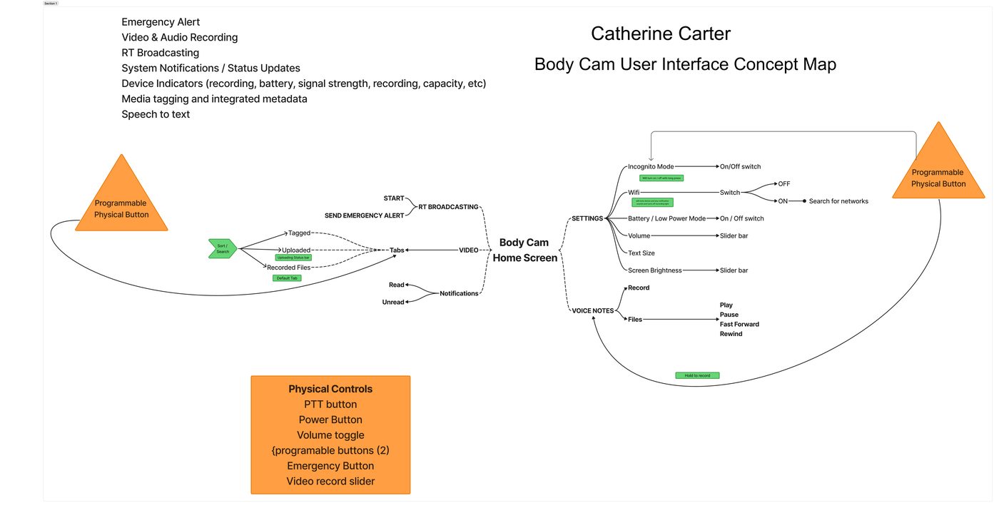
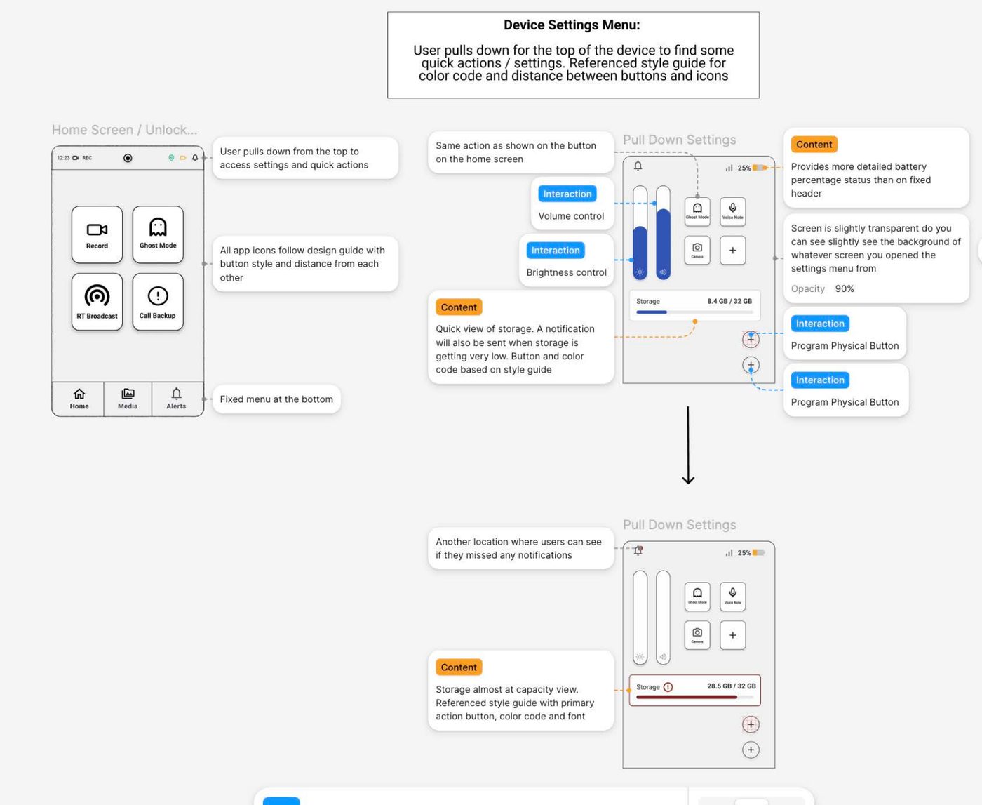
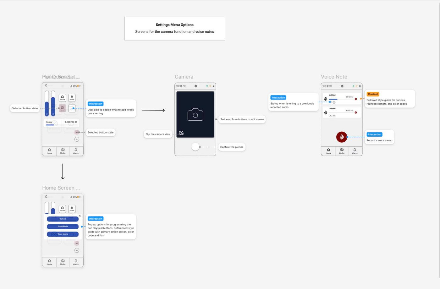
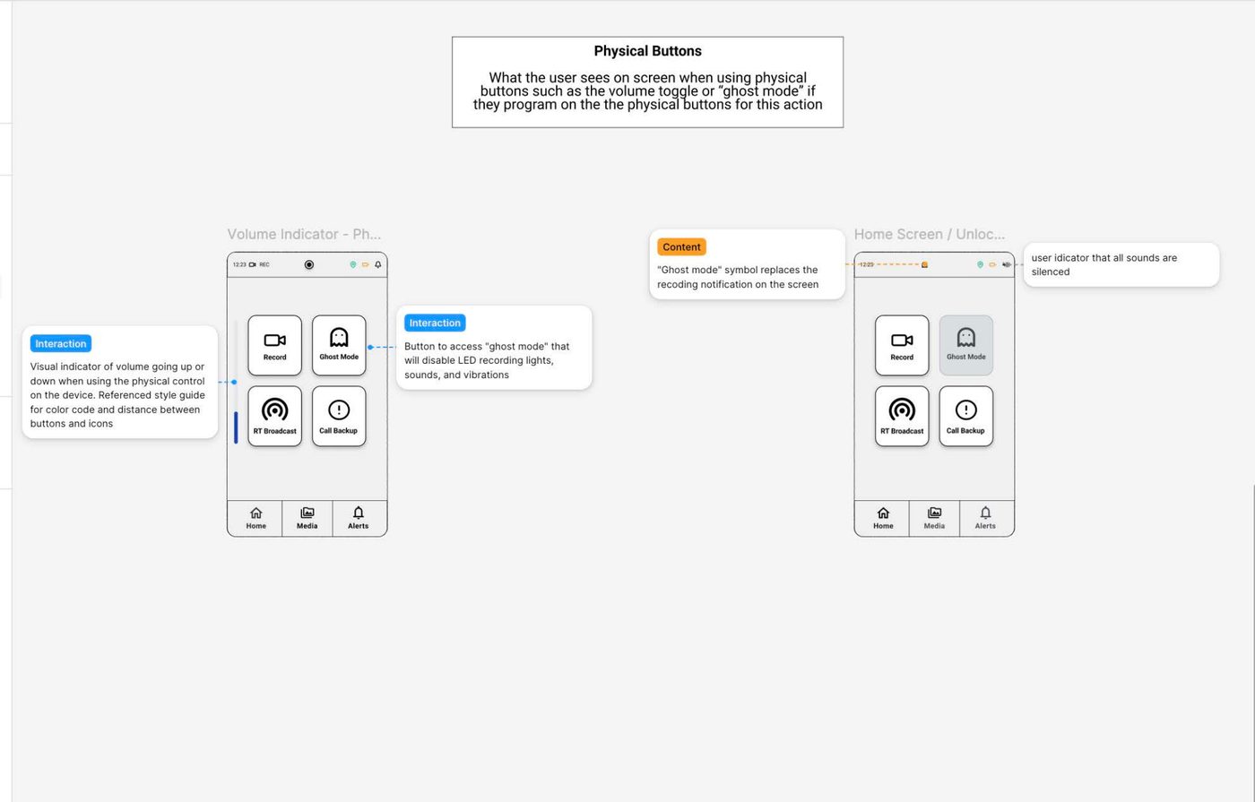
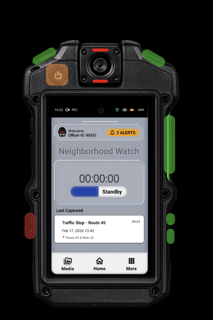
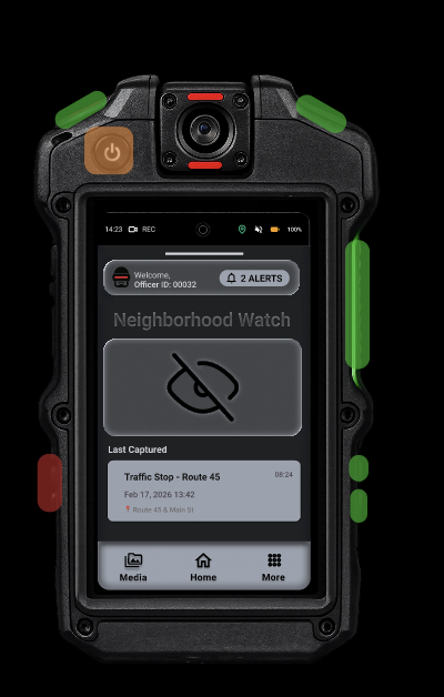
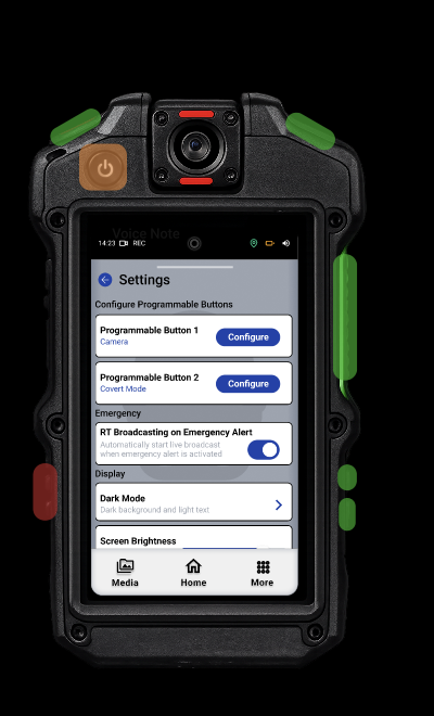
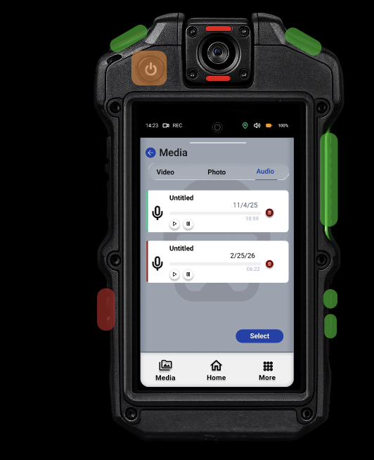
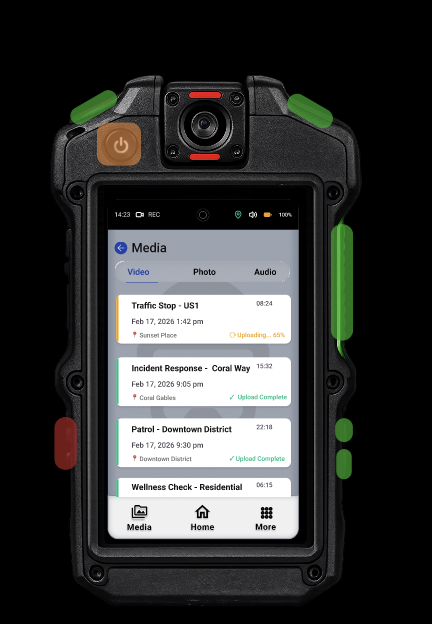
Body-Worn Camera Interface
Redesigning a police body-worn camera interface so new and less tech-savvy officers can navigate it confidently under pressure — reducing recording errors and device misuse.